
Welcome to our blog! Here is where we’ll publish posts with data visualizations from all the important European games. Our first post here is a primer on what it is we do.
Using the number of shots to calculate whether a team has played better than another has long been considered outdated as a statistic. A better way is to measure the quality of each shot and use that as a metric. This is called the Expected Goal value of a shot. The Expected Goal (xG) is the calculated chance of that shot resulting in a goal. By summing the xG for each of the two teams’ shots during the match, we are able to model an expected result.
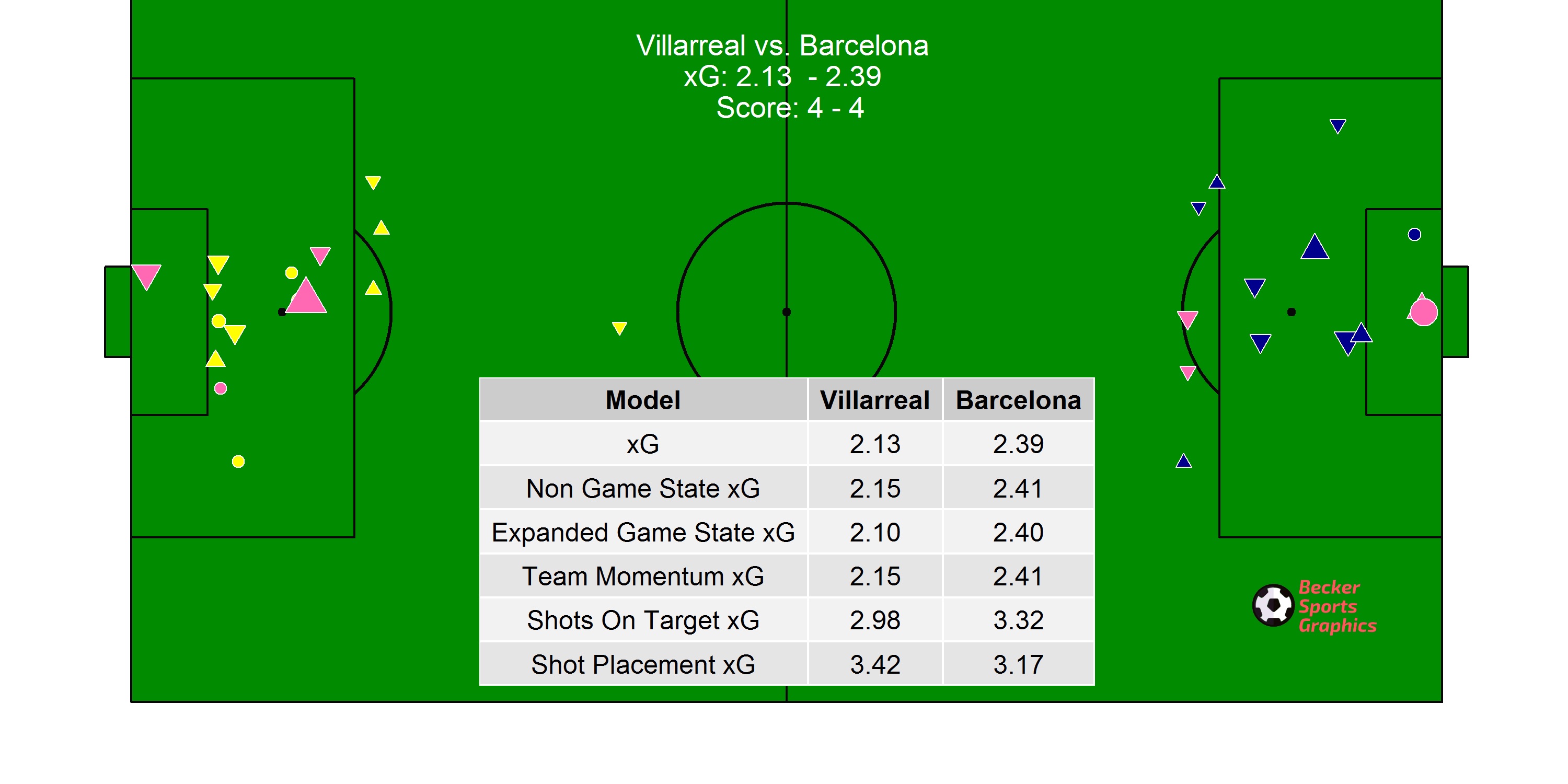
To accurately measure the xG of a shot, we use a database containing every shot that has been taken in the five major European leagues (Premier League, Bundesliga, La Liga, Ligue 1, Serie A) since the beginning of the 2016-2017 season, approximately 140,000 currently. Each shot in this database contains 57 variables, including shot location, game state, and body part used for the shot. We have cleaned this data and used it to train our regression model to predict the output of each subsequent shot. Using this model, we are able to predict the chance that a goal will be scored on each shot (output as a value between 0 and 1). For each match, we find the xG values for the teams and showcase these in visualizations. Penalty kicks are removed from the calculations, so they are just added into the titles of the visualizations to indicate their presence. Own goals are treated in the same manner.
One of our main visualizations is a match shot map. Shot maps show all of the shots from the given game. The size of the shot is determined by the xG for that shot: the larger the icon, the higher the xG. Shots that are pink are goals and all other shots are colored the shooting team’s colors. An upper triangle indicates that the shot was taken while the player’s team was winning. A lower triangle indicates that the shot was taken while the player’s team was losing. A circle indicates that the show was taken while the match was tied. We have six different models we run, with the main being what we call simply “xG”. We show our auxiliary models in the shot map visualizations. “Non Game State xG” takes out our variable that says shots are more likely to be accurate if a team is already leading. “Expanded Game State xG” goes the opposite direction, whereby the more a team is winning (losing) by, the better (worse) the subsequent shots tend to be. “Team Momentum xG” attempts to capture the post-scoring boost that a team can have. “Shots On Target xG” only takes into account shots that were on target, or going on target (e.g. blocked shots). Finally, “Shot Placement xG” incorporates the location that the shot ended up, whether wide or on goal, and if on goal then where specifically. Thus a 30 yard strike that normally would have a very small xG could be larger if we know it went towards the top corner.
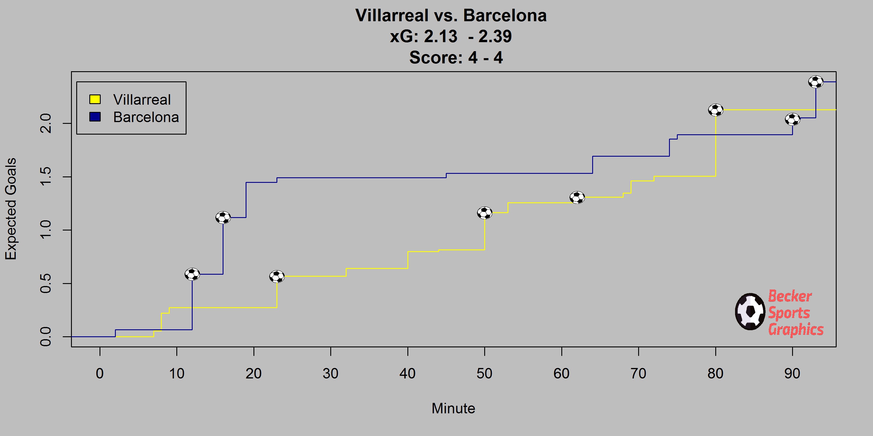
Another one of our visualizations is our Running xG. This is a step function with the time along the x-axis and the xG along the y-axis. The plot has two lines, one for each team. The lines run horizontally until a shot is taken, at which point they move vertically for the distance of the xG of the shot. Thus, reading from left to right will show the story of the match. Soccer ball images are put on each shot that resulted in a goal. A goal may be scored without a shot showing up on the Running xG plot if it were scored on a penalty kick or was an own goal.
Using the xG for each team after a match, we run simulations to determine what the expected goal difference of the match is (e.g. Team 1 winning by two clear goals), as well as the win percentage for each team. To do so, we take all the shots from one game, along with their individual xG’s, and run 10,000 Monte Carlo simulations and then output two plots based on these.
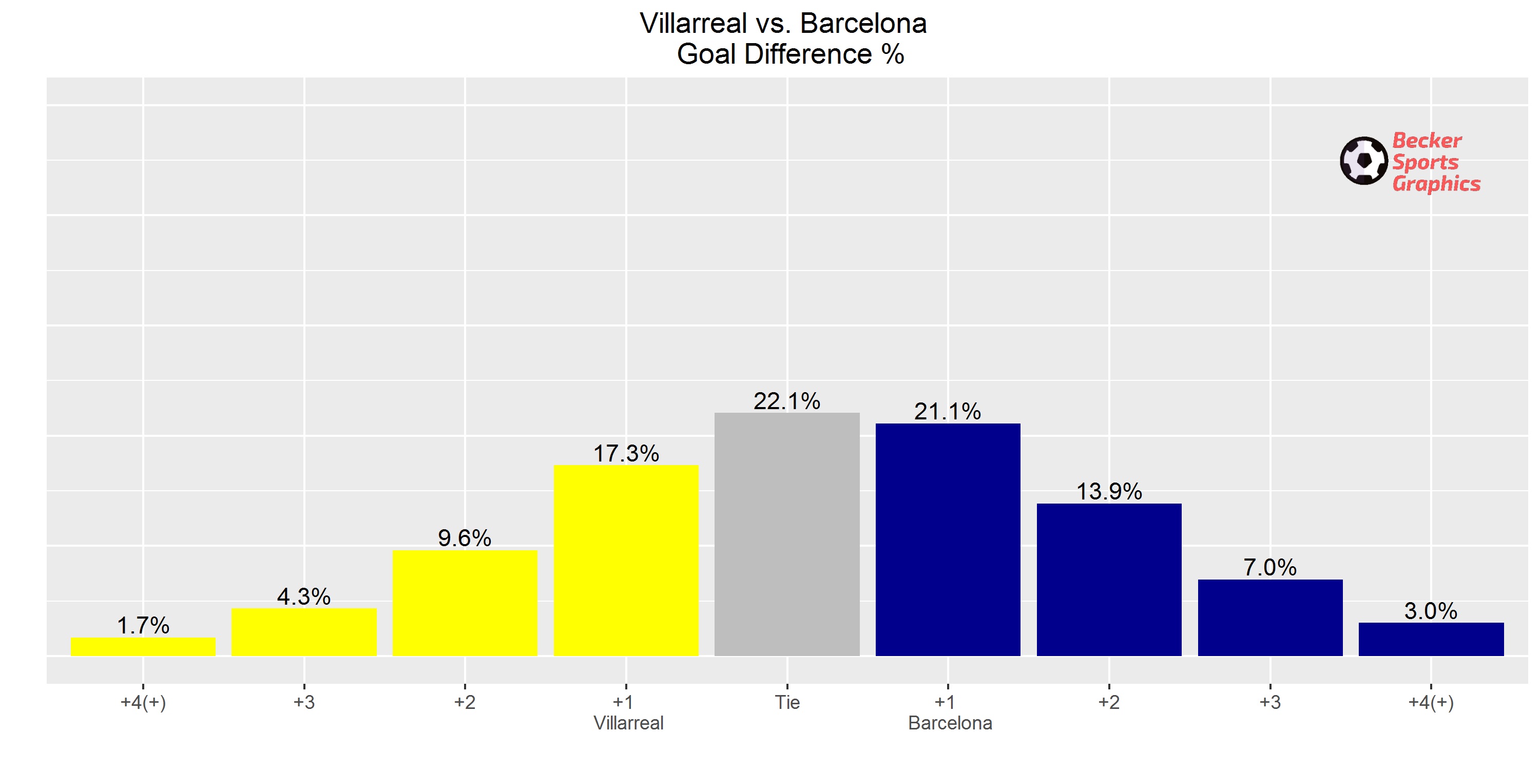
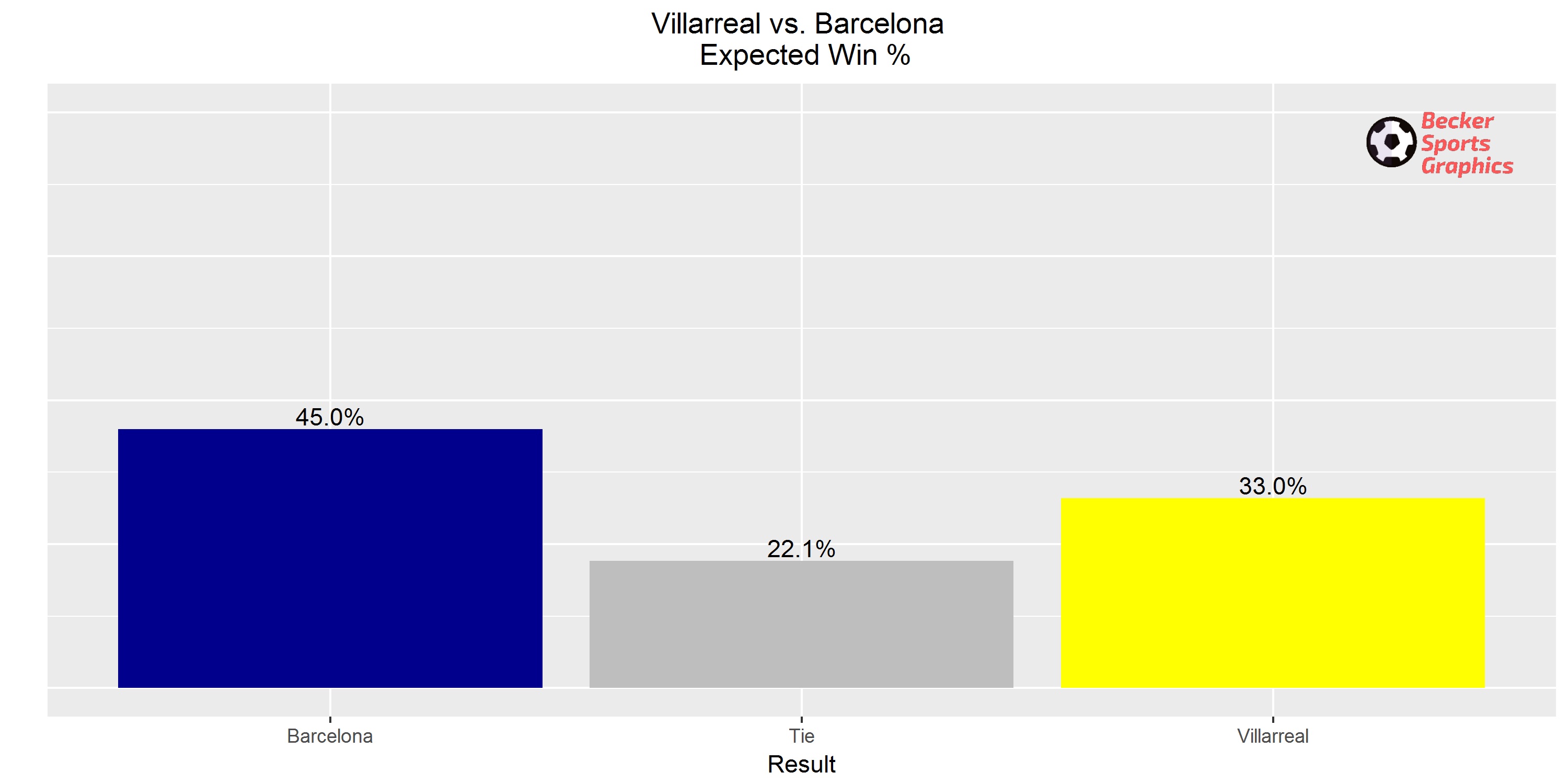
Our core output is a set of four plots per game: shot map, running xG, win percentage, and goal difference. We won’t always show all of them (there are a lot of games each weekend!), but if you’re reading this and want to reach out to see the full output from specific games don’t hesitate to reach out and we’ll send them your way.
Other visualizations are done in Tableau to visualize teams and players who are overperforming or underperforming their xG. We create these over the span of at least a couple of months’ worth of data. You can click here to see our 2018/19 player profiles and learn more about the different types of analysis we do season by season.
Thanks for coming to our blog and taking the time to read this first post! Make sure to subscribe at the bottom of the page to get each new post delivered straight to your inbox.
-Tim & Matt
